SharePoint 2010 support for mobile devices have been limited. Simple mobile views of lists and libraries were supported by mobile browsers using a mobile redirection feature. SharePoint 2013 steps up the support for mobile devices with features to support page design, content creation and remote API improvements.
This post will be the first of two post and will provide an overview of the SharePoint 2013 features that support page viewing, page design and content creation for mobile devices. The second post will provide an overview of SharePoint 2013 mobile programming. Later posts will provide an in-depth look at each mobile feature.
Mobile Views
Mobile views existing in SharePoint 2010 and have been enhanced in SharePoint 2013. Mobile views are provide a default look and feel to support basic SharePoint team site templates in a mobile browser. Mobile views provide mobile access to SharePoint lists and libraries. Mobile views are created using a page redirect to a mobile enable page. SharePoint relies on user-agent string to Site administrators can enable or disable mobile views with the Mobile Browser View feature which is enabled by default for team site, blank site, document workspace, document center and project site templates. Mobile views support basic browsing of the common list and library pages.
There are two mobile views and an optional PC View of full screen view. Older, non-HTML 5 mobile browsers display in classic mode. HTML 5 browsers display in contemporary mode. Views provide a link to display the PC View or full screen view.
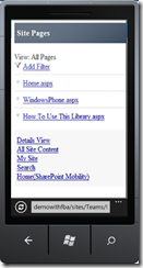
Mobile Views ( Classic, Contemporary Full)
In general when Mobile Browser View is not activated all devices will attempt to display in full screen mode which may or may not be pretty. When the Mobile Browser View feature is activated mobile devices based on the User Agent string will be redirected to a mobile page and display either the classic or contemporary view. A link in the Contemporary view will allow a view to switch to a full screen view.
Device Channels
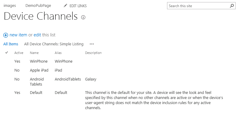
Device Channels are a new publishing feature in SharePoint 2013. Device channels allow the site administrator to define a group of devices based on User-Agent header value. Device Channels alone do not change the page rendering. Device channels are the means to “tag” a request as belonging to a specific criteria. SharePoint defines a Default device channel. Site administrators can create more device channels based on their requirements. Device channels group devices by User-Agent string allowing the site administrator to create channels that tag multiple device types in the same channel. For example a site administrator could define a Device Channel for HTML 5 phones and include Windows Phone, IOS and Android-specific agent strings for HTML-5 compatible devices. Below is a example of three custom defined channels.
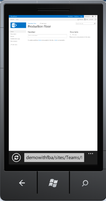
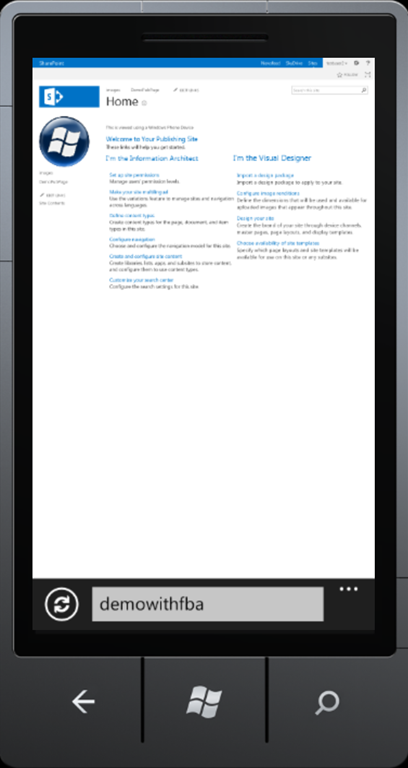
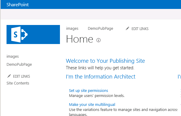
Device Channels really do not do much outside of defining categories of devices. Other SharePoint features work with Device Channels to change the look and feel or content of a page. Master pages can be changed based on the device channel. This is supported out of the box. Each channel can be associated with a specific Master page. During page assembly the device channel is determined and the appropriate Master page is used. This allows each device channel to have a unique look and feel. The below image on the left shows the page viewed from Windows Phone 7. The image to the right is the same page viewed in Internet Explorer. Only a device in the WinPhone Device Channel will display the Windows Phone logo because the logo is defined in the WindowsPhone7 custom Master page and assocatied to the WP7 device with a Device Channel.
Mobile Panel and Device Channel Controls
Device channels and master pages can change the look and feel of a Publishing site but it doesn’t do much for content. SharePoint has two new controls to manage content based on a channel, Mobile Channel Control and Device Channel Control So far there seems to be little difference between the two controls. Each control is added to a page at design time and includes an attribute to associate the control to the channel. If the active channel matches the set value of the control then the content is rendered. So far there seems to be little difference between choosing the Mobile Channel Control and the Device Channel Control. Future blog posts will dig deeper into the two controls to determine value of one over the other.
Below is an example page markup that displays text for the Windows Phone channel using the Mobile control. The contained text will display when the device is in the WinPhone channel.
<PublishingWebControls:MobilePanel runat=”server” IncludedChannels=”WinPhone”>
<p>This is viewed using a Windows Phone Device</p>
</PublishingWebControls:MobilePanel >
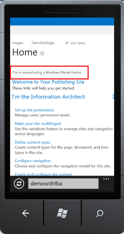
Image Renditions
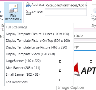
The last feature covered in this first post is Image Renditions. Image Renditions are not necessarily a “Mobile” feature but mobile page design can certainly make use of renditions. Image Renditions are generic standards for rendition sizes of an image, they are not specific for any one image. Using Image renditions a site administrator can define a collection of standard height and width for an image which can be used by content creators when defining or selecting an image. For example a “Large Banner” can be defined as 400 pixels wide and 200 pixels high. A “Small Banner” can be defined as 100 pixels wide and 25 pixels high. Image Renditions are accessed via Site Settings->Look and Feel. Blob Cache must be configured before the Image Renditions can be used.

During the design or content creation process image can be associated with a rendition. The benefit of associating an image with a specific rendition is that the image is rendered to the appropriate dimensions and place into the Blob cache. Instead of retrieving a large image and scaling it appropriately in the browser the image is scaled on the server and placed in the cache. In the mobile world where most data is transferred via a cell connection renditions can save time and money.
Associating an image in SharePoint 2013 with a specific rendition is supported with the image controls. Below shows the dialog to edit an image on a publishing page. Content creators can select the appropriate image rendition.
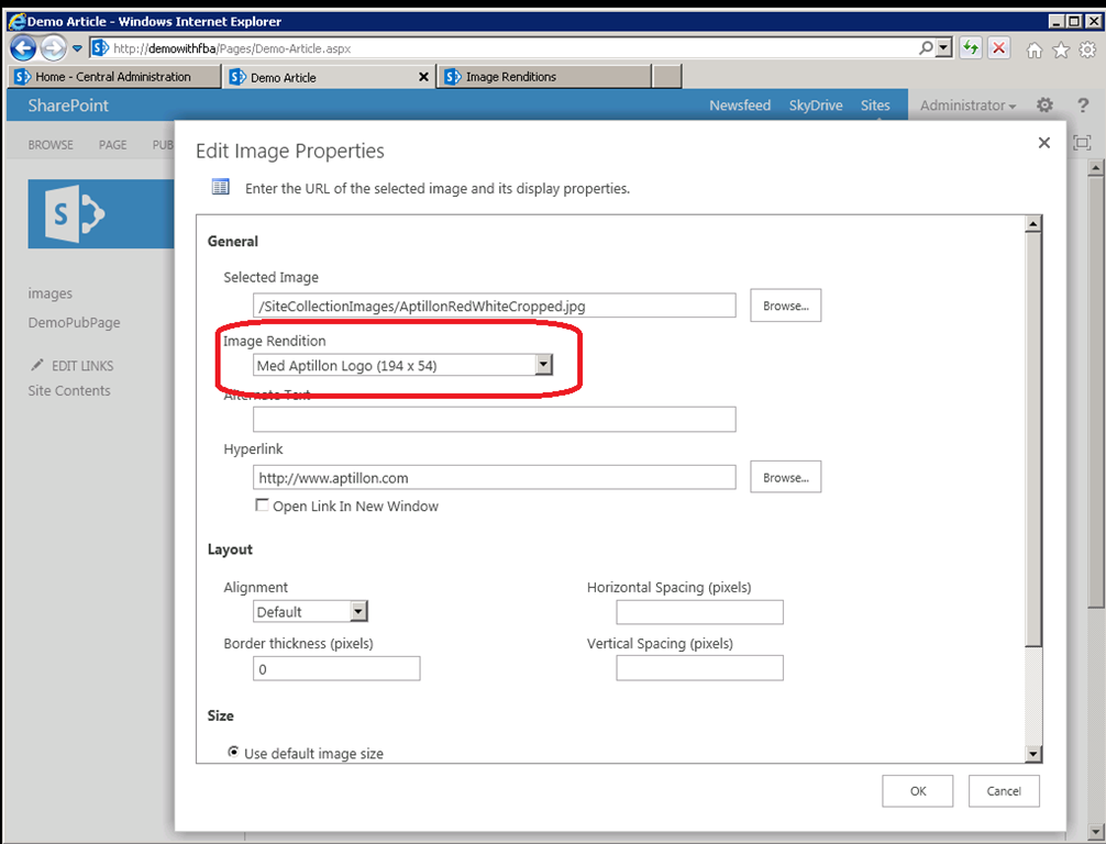
The selected rendition can also be managed using the Ribbon.
Summary
SharePoint 2013 is providing more support for mobile devices. This post focused on an overview of those features that may be used to design pages and content for mobile devices. These features are tools to be used to provide a custom mobile experience for your viewers. They are not the answer to the view experience. Mobile viewing needs to be consider in the design phase of your branding and then these tools applied with proper design, style sheets and JavaScript can make a mobile device more usable when accessing SharePoint.
Hi,
Please, be informed that The Microsoft.SharePoint.Publishing.WebControls.MobilePanel class has been deprecated and should not be used. The Microsoft.SharePoint.Publishing.WebControls.DeviceChannelPanel
class should be used instead